Getting background colours to go all the way
Simon Hamp
Software Engineer
I'm pretty proud of the Gitamic diff viewer. It's not perfect (and probably never will be thanks to different browser rendering engines), but it can handle some pretty gnarly diffs quite rapidly.
("Quite rapidly" being somewhat subject to your perspective)
Of course, a lot of this is down to browsers rendering engines getting faster and faster. So I can't really take any credit.
But it still took me a while to make it as quick as it is. One thing that I did learn tho:
Don't use a <table> to render a diff; They are slow as all hell!
One thing that I 'fixed' (again, subjective) the other day that I want to talk about now is the backgrounds on diff lines.
The problem
I really wanted the diff viewer to have all the normal visual cues you might be used to from other Git interfaces, like GitHub/Gitlab/Tower etc.
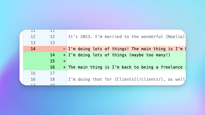
And for the most part, my first pass at that managed wasn't half bad: background colours, sticky line numbers, configurable context length, toggleable line wrapping...
But then one day I saw this:
Why is this happening?
Well, to explain that, it will help to set the scene a little, because... it's complicated.
Each diff is made up of lots of <div>s - "diff-divs", if you will:
- the File Card - a panel that presents all the diff chunks from a single file in Git's index (these are collapsible)
- a Chunk panel - a collapsible panel that renders a single chunk - n lines of changes plus context lines
- the Line Numbers column
- the Lines container - which will hold all of the lines and over which the Line Numbers column will appear to float
- each line of the diff's content - basically one
divper line of output fromgit diff
<div class="file">
  <div class="chunk">
    <div class="line">
      <div class="line-numbers">
        <!-- These are complex for layout reasons -->
      </div>
      <div class="context">
        <!-- This line of the diff -->
      </div>
    </div>
    <div class="line">
      <div class="line-numbers"></div>
      <div class="old"></div>
    </div>
    <div class="line">
      <div class="line-numbers"></div>
      <div class="new"></div>
    </div>
    <div class="line">
      <div class="line-numbers"></div>
      <div class="context"></div>
    </div>
  </div>

  <div class="chunk">
    ...
  </div>

  ...
</div>
This is simplified for the sake of this example. In reality, each div.chunk has more to it, which gives us further constraints that we also need to consider, such as its header.
(I know on the surface, this looks more complicated than a table, but trust me, your browser can render this wayyyyy faster)
Each div.file is a fixed-width card. This card is what creates that neatly contained, white background with a contextual heading. In diffs with many files, this helps the user spot that they're now moving to a different file, as they will see the one card end and a new one begin.
Fixing the width keeps the card completely visible within the available viewport. Nice.
However, each div.chunk needs to be set overflow-x: auto to allow long lines inside it to be seen and scrolled over.
If I were to set the overflow on div.file, then all chunks will be scrolled together.
That's not desirable from a UX perspective: when I'm looking at one chunk, I don't want another to be scrolling in and out of view.
What's more, for really big diffs, it will be the cause of some super janky scrolling.
And we'd also get a whole load of other visual regressions that would need to be solved, introducing even more complexity.
The backgrounds themselves (which are just background-color) are applied to the relevant div.line, based on its type: old, new, context, respectively.
(For those of you who want to make sure I'm not being completely psychotic - yes, these are generally well split into separate Vue components)
Back to why...
In HTML, when a container that has a background colour is inside another container that has a fixed width, the background colour rendering stops where the parent container stops.
This saves the browser from doing any work it probably doesn't need to do: calculating where the background should be rendering for any elements that in theory don't have anything visible outside of the visible viewport.
But, in practice of course, it's entirely possible for some child elements to "pop" out of their parent, especially when you explicitly allow a fixed-width element to overflow (e.g. with overflow-x: auto).
In that scenario, constrained children can appear to have their background clipped if other, wider children overflow the container and cause it to scroll.
It's not a show-stopper, but it's a little unsightly. Not exactly the experience I want for a premium add-on that folks will have paid for.
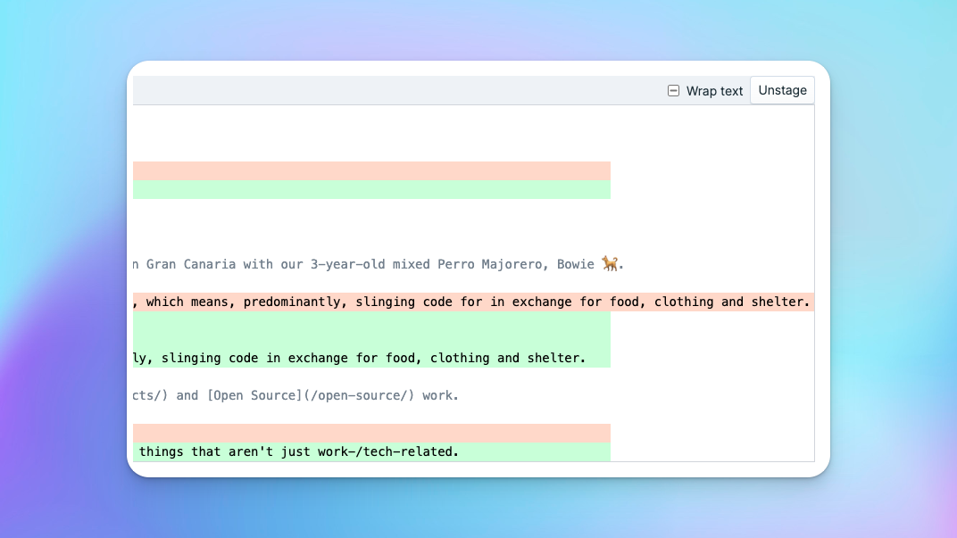
But the other - slightly more frustrating - problem this causes is that any sticky elements, such as the line numbers column, get trapped at that same point; wherever the parent container's 'official' width finishes.
So for lines that are considerably wider than the parent container's width, you could end up seeing this:
Why?
Because the sticky element can't jump out of its container - the parent whose width is fixed to a width that is incorrect.
So why not just let that parent container go full width?
That would result in the parent node (in this case, the File Card) being the element that manages the horizontal scroll... which we've already determined would lead to all of the diff chunks scrolling horizontally together.
And, y'know, it still doesn't solve the problem! There will still be some clipping, it will just be at a different place. In fact, just pushing the problem up the DOM tree only makes things worse for us.
Don't want. No good.
No, we need to solve this right here.
We might be able to introduce more complexity to the DOM and try to find some variation of divs that allows us to find some magical combination that meets all the requirements and Scotch-tape the whole thing together with a bunch of Javascript... but trust me, performance will suffer on a number of fronts, especially when rendering new diffs or redrawing during scroll.
There is a solution!
For me, the solution to this problem lies in combining good old CSS with just a sprinkling ✨ of Javascript.
I will admit tho, it's a tad disappointing that CSS can't solve this one alone for us yet - and sadly I'm not sure it ever will.
Basically, in order to force the background to stretch to the same width for all the lines, we need to explicitly tell the browser that they should all be 'yay wide'.
In other words, we have to apply a set width or min-width to all of them and not rely solely on the browser to work out how wide each div should be.
We could hard-code a very wide, fixed width to these to try to account for really long lines... that could even be done in pure CSS and with just a few extra bytes applying that width to the every div.line.
But then all chunks will be able to scroll... realllllly far... whether they need to or not (blerch) and I bet there will still be cases where one line goes just a little further than we've allowed for.
And besides, we've got these super powerful calculators rendering these views - it should be able to work out what the widest line is and make all of them the same width.... right?

But how can we find out what that width should be?
We could cycle through each element and find the longest one, but there are problems with that: if we have a lot of elements, it's going to be slow. Plus, if the elements aren't always there, timing is going to be an issue as we won't get the widths until they're fully rendered.
But, for argument's sake, let's say our timing issues are all solved and we can put up with a few extra milliseconds on the render time, how do we even get the full width of those long lines? It turns out that getClientWidth and getClientBoundingRects().width will only give us the visible width available to the viewport, not the full width.
Thankfully, the droids we're looking for are captured in the scrollWidth of the parent - that overflowing sonuvva, div.chunk, that has created this problem in the first place also has the solution hidden within the depths of its dark DOM-matrix!
scrollWidth is what the browser uses to determine how far the scrollbar needs to travel and how big the scrollbar handle needs to be. Thankfully, it applies it to the container that has the overflow-x, after it's determined how wide its currently-rendered contents are1.
That means we can use it as the explicit width of all of the child elements! 🎉 Awesome!
It also means there's no need for us to run a loop over all of the n-long set of div.line elements.
We can just grab the scrollWidth value from the div.chunk and apply it as an inline style to each div.line:
<div v-for="line in change.lines" ref="lines" class="line">
  <!-- Line template code here -->
</div>

<script>
function recalcLineWidths() {
    this.$refs.lines.forEach((line) => {
        line.style.minWidth = `${this.$refs.chunk.scrollWidth}px`;
    });
}
</script>
(Again, this code is just for demonstration purposes. The actual logic is a little more convoluted.)
recalcLineWidths is executed at choice intervals when I know the line widths might have changed, such as when changing from wrapped to non-wrapped text.
It's still not perfect, but for the 90% use-case, where you just have some files that have really long lines, it does the trick.
This is coming to Gitamic in an upcoming point release soon.
For lots of lines, 'currently-rendered' will mean the timing of your call to
scrollWidthmatters immensely, because the value will be recalculated a number times over potentially thousands of nanoseconds. You need to wait until the very end of the render cycle. ↩